Uncommon truths: Extending time horizons and the strategic role of commodities

Events during 2025 have encouraged a focus on daily news flows. This may not produce the best investment outcomes. Luckily, one thing that helps lengthen time horizons is happiness. An analysis of long term returns reveals a surprising strategic role for commodities and gold.
After the volatility seen in April, markets seem to have calmed down. It does not feel as though news flows have calmed (tariff threats, spats with Fed Chair Powell, budget issues in the US and elsewhere, conflicts in Ukraine and the Middle East, political instability in Japan, for example) but perhaps markets have learned to filter out a lot of the noise.
This said, economic data flows from the US point to neither recession nor rampant inflation, which is a comfort. I have the feeling that the US economy is slowing, based on lacklustre retail sales growth, ISM surveys close to or below 50, some weakening labour market indicators and the Conference Board Leading Indicator that has weakened in all but one month so far this year (the exception was May, when it was flat). However, I do not think there will be recession, though the 1 August release of July payroll data may be worth watching (July tends to be one of the weaker months of the year and it was a weak reading last year that caused market volatility in early August).
On the inflation front, you have to look pretty hard to see signs of a pick-up. For example, neither import, producer nor consumer price indices have shown signs of a big uptick (the June data for the Fed’s favoured PCE measure is due on 31 July).
However, I suspect it is too early to judge the full effect of tariffs on US inflation. First, the final set of tariffs has not yet been decided, so US importers have not yet had to face up to the full extent of the problem. Second, the 0.5% dip in GDP in Q1 was largely the result of a 4.6% negative contribution from net exports (imports were up an annualised 38% during the quarter, ahead of the imposition of tariffs). That suggests a build-up of inventories (2.6% contribution to GDP) that were likely run down during Q2, thus temporarily shielding US consumers from the price effect of tariffs (as an aside, I expect the 30 July Q2 GDP data to show a rebound). Finally, other factors have been weighing down on inflation, notably the decline in oil prices and the gradual decline in the shelter component of CPI (remember that?). Indeed, the latter has fallen from 5.1% in June 2024 to 3.8% in June 2025 and I think it will continue to follow house price inflation downward.
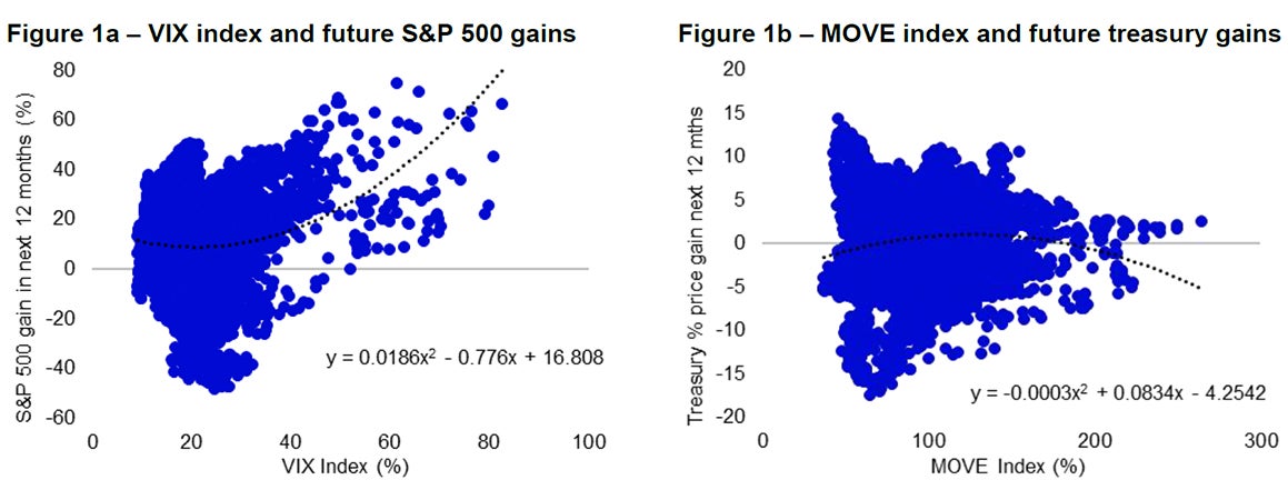
The above reveals that the coming week could be important in terms of US data flows, with Q2 GDP, June PCE and July employment reports. However, I have recently been trying to encourage investors to adopt a long term approach and avoid getting bogged down with short term swings. Early April was a case in point, with the VIX index of implied volatility on S&P 500 options reaching 58, as fears of recession abounded. At those moments of peak-fear, the temptation is to cut positions but Figure 1a suggests the opposite approach has tended to work in the past. When the VIX index has been above the mid-fifties, the S&P 500 has always delivered positive gains over the following 12 months.

Note: Past performance is no guarantee of future results. Figure 1a: Based on daily data from 2 January 1990 to 15 July 2024 (as of 15 July 2025). VIX is the CBOE VIX Index and is a calculation designed to produce a measure of constant, 30-day expected volatility of the U.S. stock market, derived from real-time, mid-quote prices of S&P 500® Index (SPX℠) call and put options. Figure 2b: Based on daily data from 2 January 1990 to 15 July 2024 (as of 15 July 2025). MOVE is the ICE BofA US Bond Market Option Volatility Estimate Index and measures the implied volatility on 1-month options on US treasury futures weighted across maturities of 2, 5, 10 and 30 years. “Treasury % price gain” is the percentage change in the ICE BofA US Treasury Price Return Index over the following 12 months.
Source: CBOE, ICE BofA, Bloomberg, LSEG Datastream and Invesco Global Market Strategy Office.
Unfortunately, the picture is not so clear when looking at the ICE BofA MOVE index of implied volatility in the US treasury market. Figure 1b compares the MOVE index to future returns on the ICE BofA US Treasury Price Return Index (the price index is used rather than total returns as the addition of interest income biases the returns upward). As can be seen, there is no compelling tendency for high readings of the MOVE index to be associated with positive future returns. The only exception is when the MOVE index has been above 225 but that only occurred in October 2008, after which the Fed started its new policy of quantitative easing which I suspect pushed yields lower (and returns higher).
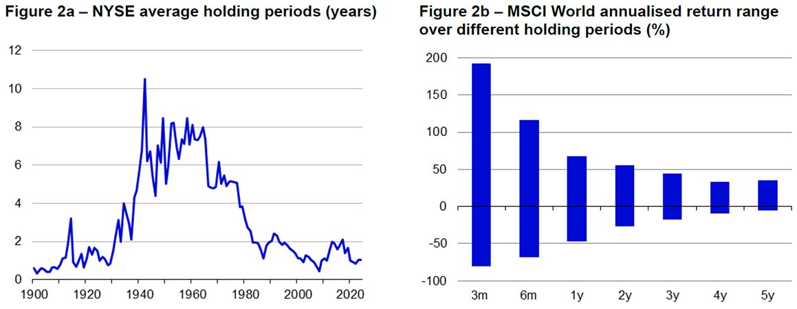
At least when it comes to equities, there is some historical support for the notion that it is best not to be too active when it comes to trading strategies (perhaps short term trading is based on emotion rather than concrete analysis). Unfortunately, it would appear that investors have become more active in the post-war period, with NYSE average holding periods falling from around six-to-eight years to around one year in 2024 (see Figure 2a). Interestingly, examples of years in which the average holding period previously bottomed include 1928/29, 1987 and 2008, all of which were followed by market chaos (I suspect trading becomes more frenetic when markets are in buoyant mood). As an aside, the average holding period fell to ten months in the first half of 2025.
Apart from the investment opportunities that could be missed if we trade too aggressively, Figure 2b suggests that the range of outcomes for equity returns (in annualised terms) is much wider for short holding periods than for longer horizons (based on historical MSCI World data). The same pattern applies to global bond returns (based on the ICE BofA Global Government Index). That suggests to me that we can be more certain of outcomes over longer investment horizons, which is good news as I believe this requires less focus on day to day data flows and more focus on longer term fundamentals (which I think is easier to predict).
The good news does not end there, as one thing that helps us to extend time horizons is happiness. I wrote on this topic in 2018 (Cigarettes, sunshine and happiness). Based on an analysis by Guven and Hoxha (Rain or shine: happiness and risk-taking, The Quarterly Review of Economics and Finance, August 2015), it would appear that the happier we are, the more optimistic we become about life expectancy, the more considered we become in our decisions, the greater our self-control, the lower our inflation projections, the less risk that we seek and the lower the discount factor we use when balancing the present against the future. That latter item suggests to me that happiness helps us to focus on the longer term.
So, what makes us happy? Guven and Hoxha concluded that sunshine (when we don’t expect it) adds to happiness. Other factors that add to happiness are income, good health and marriage (but not children). Interestingly, happiness appears to decrease if we are selfish or untrusting (see Tom Lane’s How does happiness relate to economic behaviour? A review of the literature, Journal of Behavioural and Experimental Economics, June 2017). In other words, be nice!
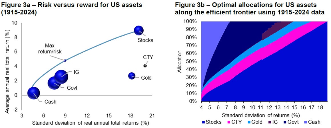
Having suggested that happiness helps us lengthen our investment horizons, what does history tell us about long-term asset returns? Figures 3a and 3b show evidence for US assets since 1915.

Note: Figure 2a: annual data from 1900 to 2024. Average holding period is the inverse of the turnover ratio. Figure 2b: past performance is no guarantee of future results. Based on monthly total return data for MSCI World in US dollars, from 31 December 1969 to 30 June 2025. Data shows annualised returns over rolling holding periods of differing length.
Source: Global Financial Data, MSCI, LSEG Datastream and Invesco Global Market Strategy Office.
Using inflation adjusted calendar year returns, Figure 3a shows the average versus the standard deviation of returns. The efficient frontier is also shown (the maximum return for each level of risk or standard deviation), along with the “Max return/risk” point that shows the point on the efficient frontier that maximises the ratio between return and risk. The size of the bubbles is in proportion to the average pairwise correlation with the other assets in the chart. The smaller the bubble, the greater the diversification capabilities of the asset. The bubble for commodities (CTY) is hollow and small because the average correlation with other assets was a small negative number (-0.02). At the other extreme, investment grade credit (IG) had the highest average correlation (0.37). For details of the proxies used for each asset class, please see the footnote to the chart.
The ordering of asset returns is broadly as I would expect. There is clear evidence of the equity risk premium versus government bonds (and risk premia on government bonds versus cash and on IG versus government bonds). However, the same does not apply to either gold or commodities, both of which have shown similar volatility to stocks, but with returns more akin to fixed income assets.
However, that does not mean that gold and commodities have no role to play in optimal portfolios. Quite the opposite. Figure 3b shows the optimal allocation at each point along the efficient frontier (i.e. the allocation that would have given the highest return for each standard deviation of return). Interestingly, commodities would have had a role at all points along the efficient frontier, except at the very highest level of volatility (where only a 100% stock allocation works). At the other end of the spectrum, returns can be enhanced above what the lowest volatility asset (cash) could generate by adding a bit of commodities and an even smaller part of gold (the optimal allocation would have been 90.8% cash, 8.1% commodities and 1.1% gold). Gold would also have had a role to play until the higher levels of volatility, from which point only stocks and commodities remain, until commodities eventually drop out. Stocks are virtually always present, disappearing only at the very lowest volatility point of the efficient frontier.
To emphasise that past performance is no guarantee of future results, it is worth considering how the results have changed since I first ran the exercise using 1915-2016 data (see Perspectives on asset allocation, November 2017). Since then, interest rates and bond yields have risen (depressing bond returns) and gold has performed strongly. Optimal allocations using that earlier dataset suggested a smaller role for gold, no role for government bonds and a bigger role for IG. The latter appears to have been squeezed out to some extent (by gold and government bonds) in the current exercise.
Unless stated otherwise, all data as of 25 July 2025.

Note: Past performance is no guarantee of future results. Based on calendar year data from 1915 to 2024. Calculated using: spot price of gold, Global Financial Data (GFD) US Treasury Bill total return index until December 2018 and then ICE BofA 0-3M treasury total return index for cash, our own calculation of government bond total returns (Govt) using 10-year treasury yield until January 1978 and the ICE BofA US treasury total return index thereafter, GFD US AAA Corporate Bond total return index until February 1976 and the ICE BofA US Corporate total return index thereafter (IG), Reuters CRB total return index until November 1969 and then the S&P GSCI total return index for commodities (CTY) and Robert Shiller’s US equity index and dividend data for stocks (see appendices for definition). Indices are deflated by US consumer prices. Figure 2a: Area of bubbles is in proportion to average correlation with other assets. “Max return/risk” shows the point on the efficient frontier that would have produced the highest ratio between return and standard deviation of returns (the size of this bubble is of no consequence). Figure 2b: For each level of risk (standard deviation of returns), the chart shows the allocation of assets that would maximise returns and therefore be on the efficient frontier (based on calendar year returns in 1915-2024 inclusive).
Source: LSEG Datastream, Global Financial Data, ICE BofA, Reuters CRB, S&P GSCI, Robert Shiller, Invesco Global Market Strategy Office.
Investment risks
The value of investments and any income will fluctuate (this may partly be the result of exchange rate fluctuations) and investors may not get back the full amount invested.


